INTRODUCTION
Known for its iconic markets and plethora of parks, the locality of Jayanagar in Bangalore is known for rectilinear mains and crosses. The client, Tovo operates a fabled chain of restaurants surrounding the concept of Infused Cuisine. The brief was to design for a casual restaurant serving infused grilled chicken.
The mission of “Being Good, Doing Good and Feeling Good” with attention to highlighting fresh local produce and making visitors feel welcome resonates in the design. The restaurant is of 740 square feet on the ground floor and 600 square feet on the first floor. It seats 28 people on the inside and 10 on the outside.
The Facade:
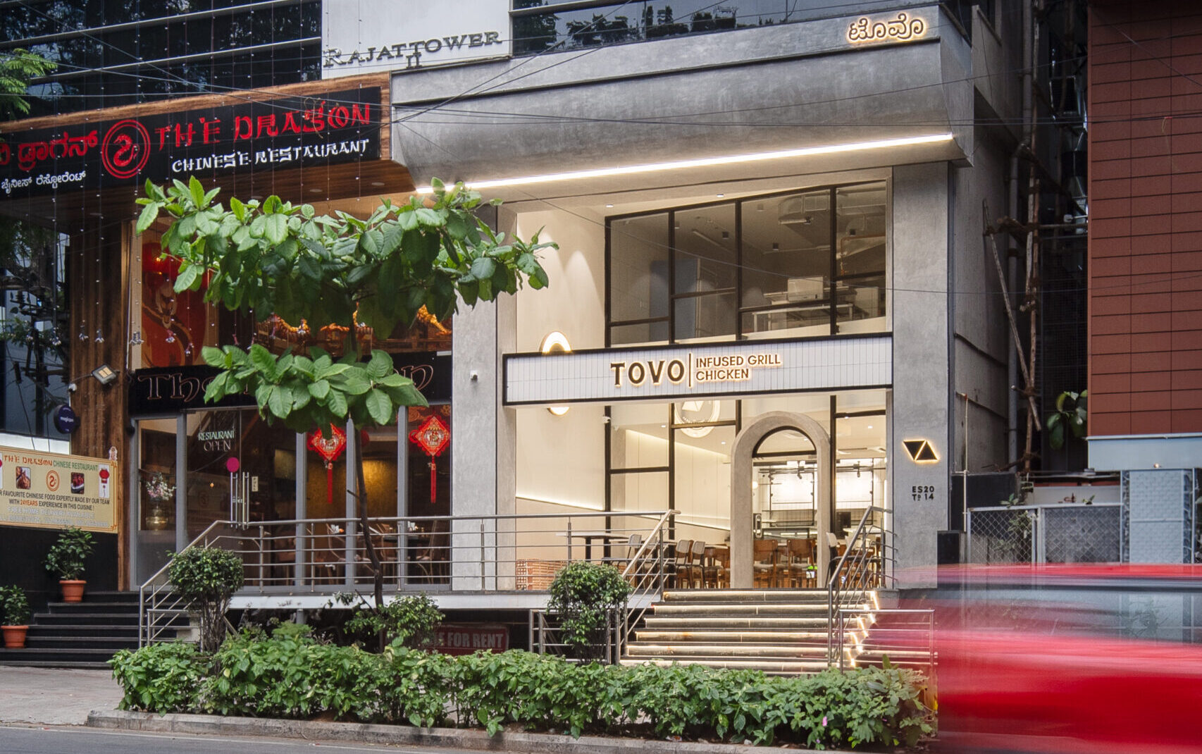
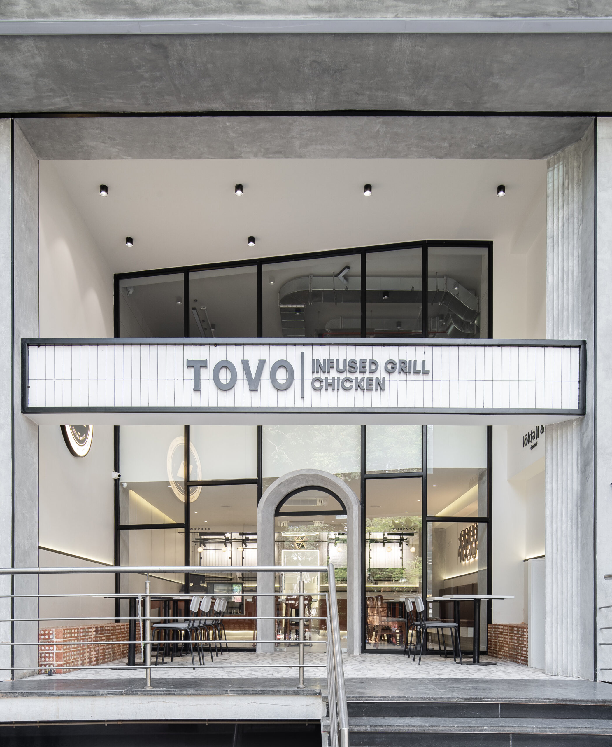
Being at the forefront in a commercial complex, it was crucial to big attention towards the restaurant, while standing apart from others in the vicinity. To represent the pillar of sustainability in Tovo, the cladding material chosen was Indo Wud.
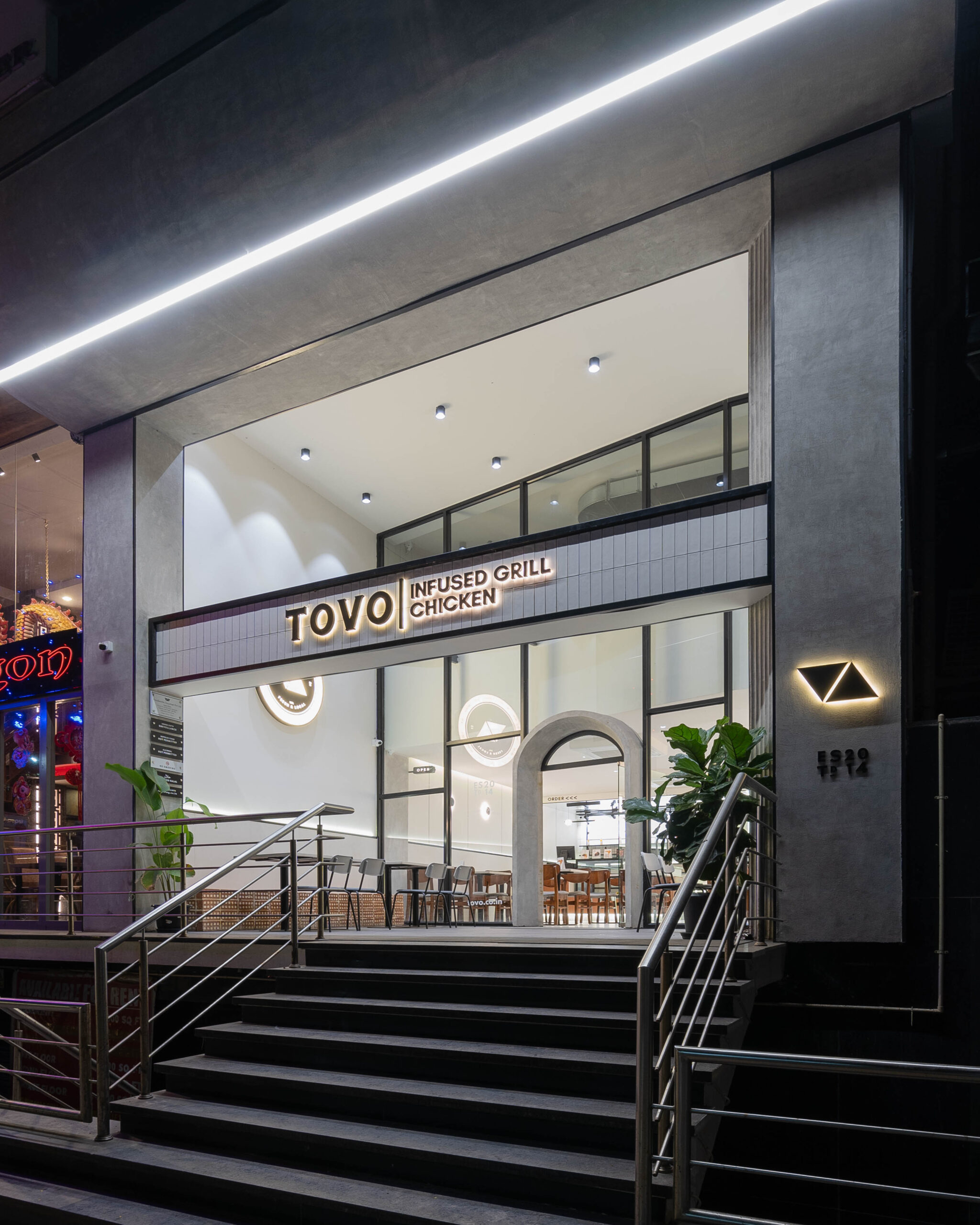
A monochromatic colour palette was chosen, featuring Asian concrete as the primary finish, which is functional and a perfect earthy base colour to add accents. The logo of Tovo is featured with the establishment year of the chain in 2014 and all these details are highlighted with warm lighting.
Accents of black stainless finish on the glass walls accentuate the details and act as the perfect backdrop for the name board. To add that pop of brightness and highlight the name of the restaurant, a choice of white subway tiles for the name board helped visualize the brand even from afar.
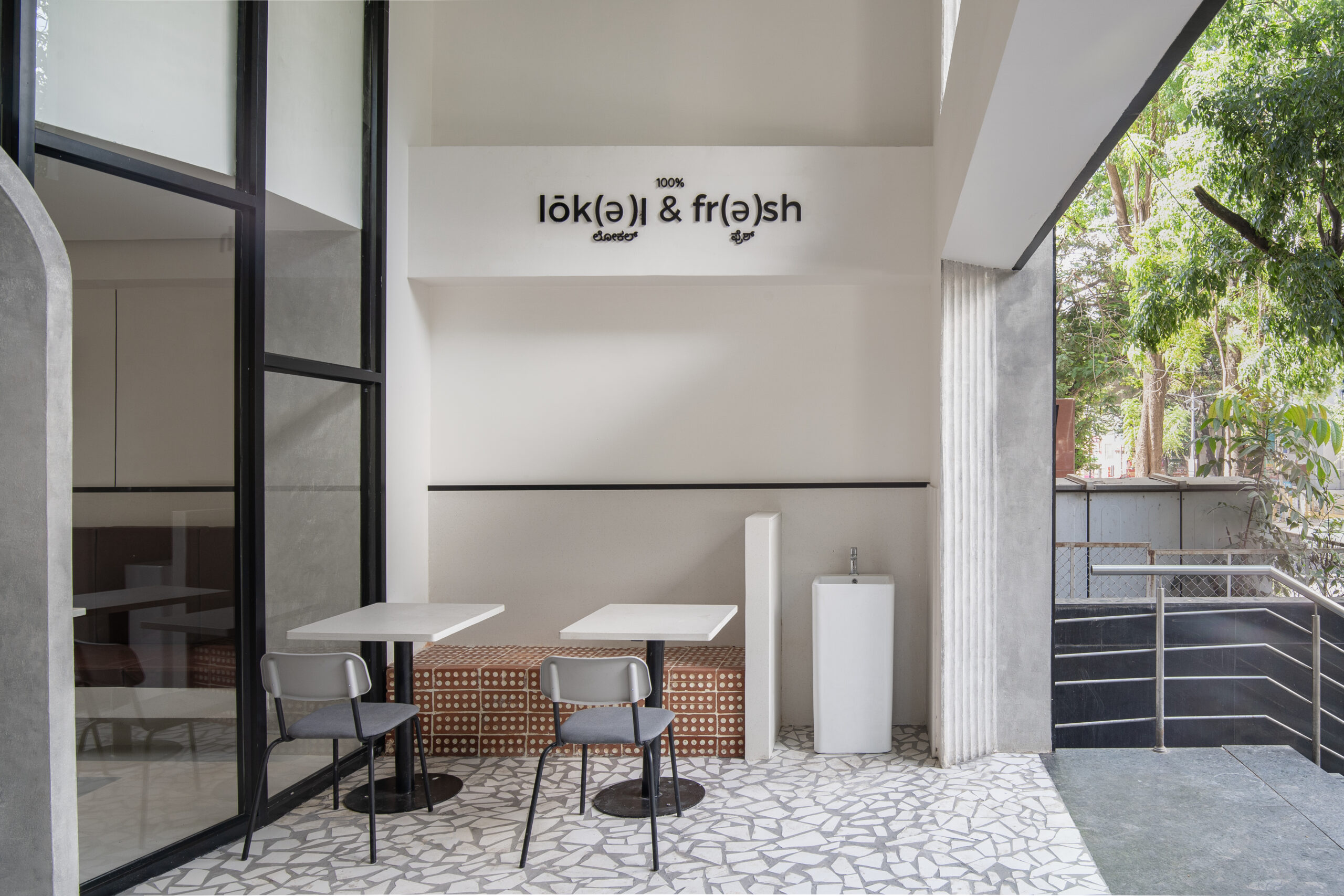
A huge concrete arch welcomes guests into the restaurants and the curve breaks the monotony of lines and sharp edges. To maintain the identity of Kannadiga culture, it was imperative to add the restaurant name in Kannada as well.
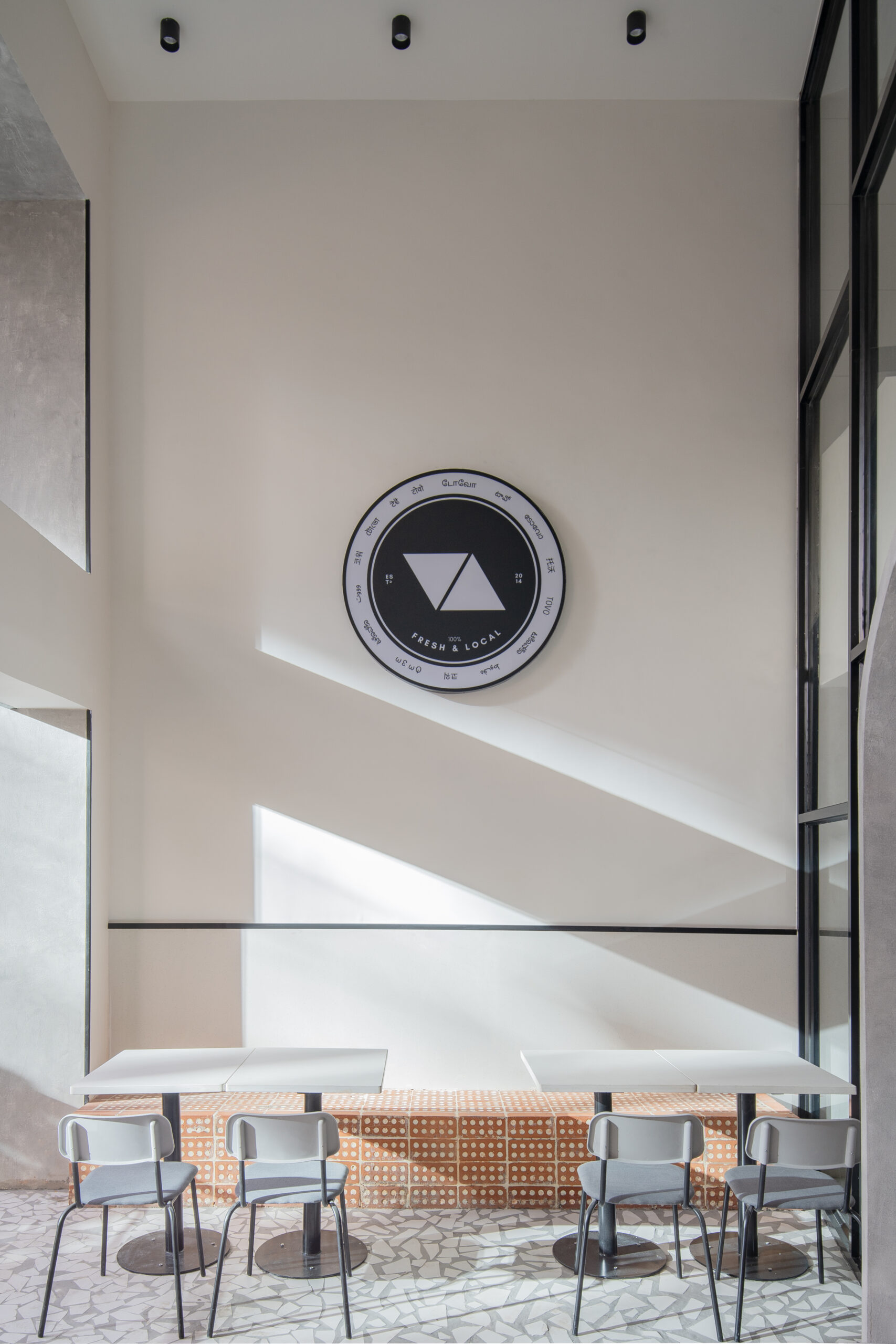
The double height plays a major role in creating a strong visual identity for the restaurant.
The patio is light with heavy-duty downlights which hit the walls creating a play of light and shadow on the walls with the drop pattern.
Space Planning:
The climate of Bangalore complements both indoor and outdoor seating. The glass facade is pushed in to create an offset, which is for outdoor seaters. This creates interest for anyone walking across the road.
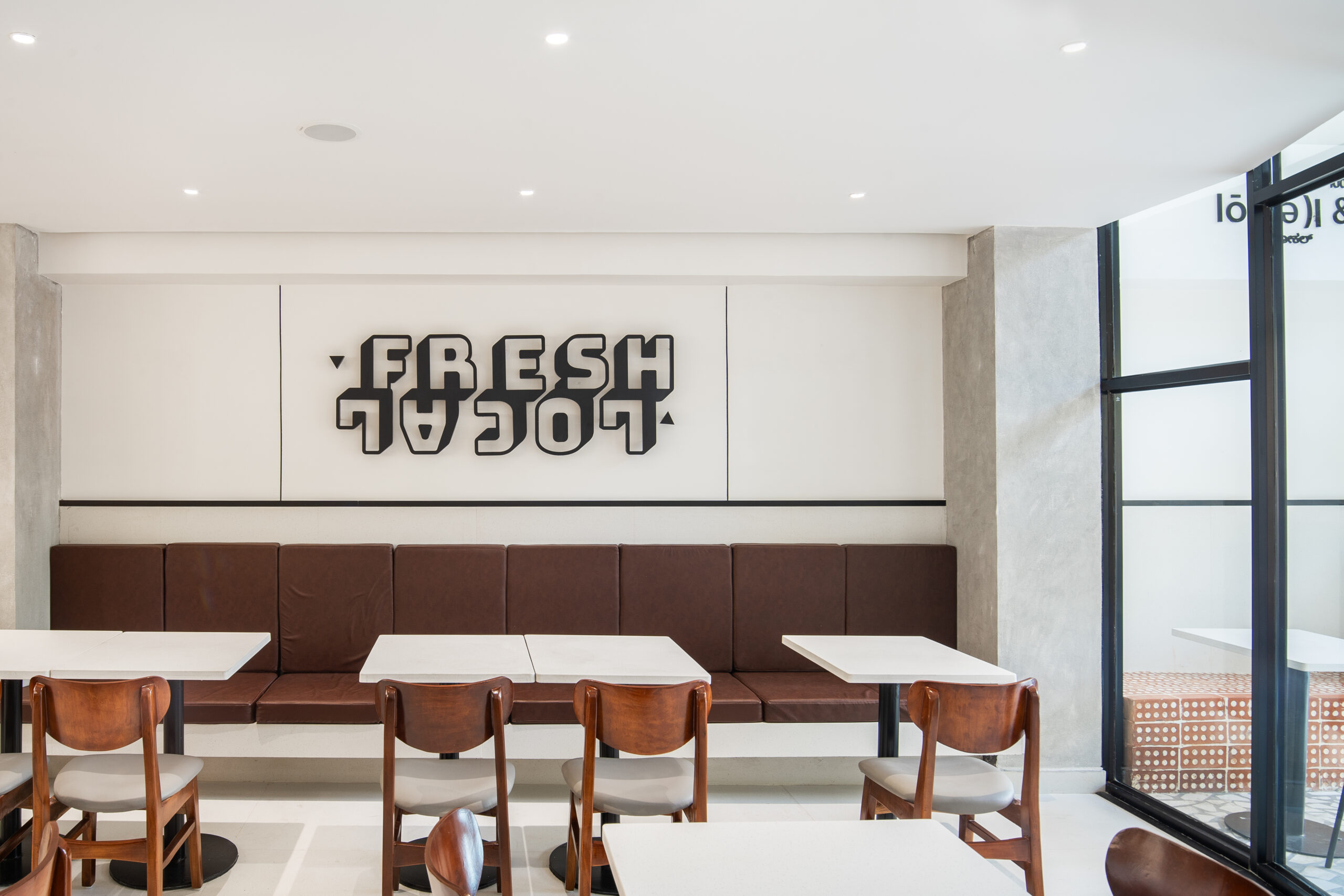
These seaters are made with Porotherm block, again a natural material which adds a rusty brick colour to the outdoors.
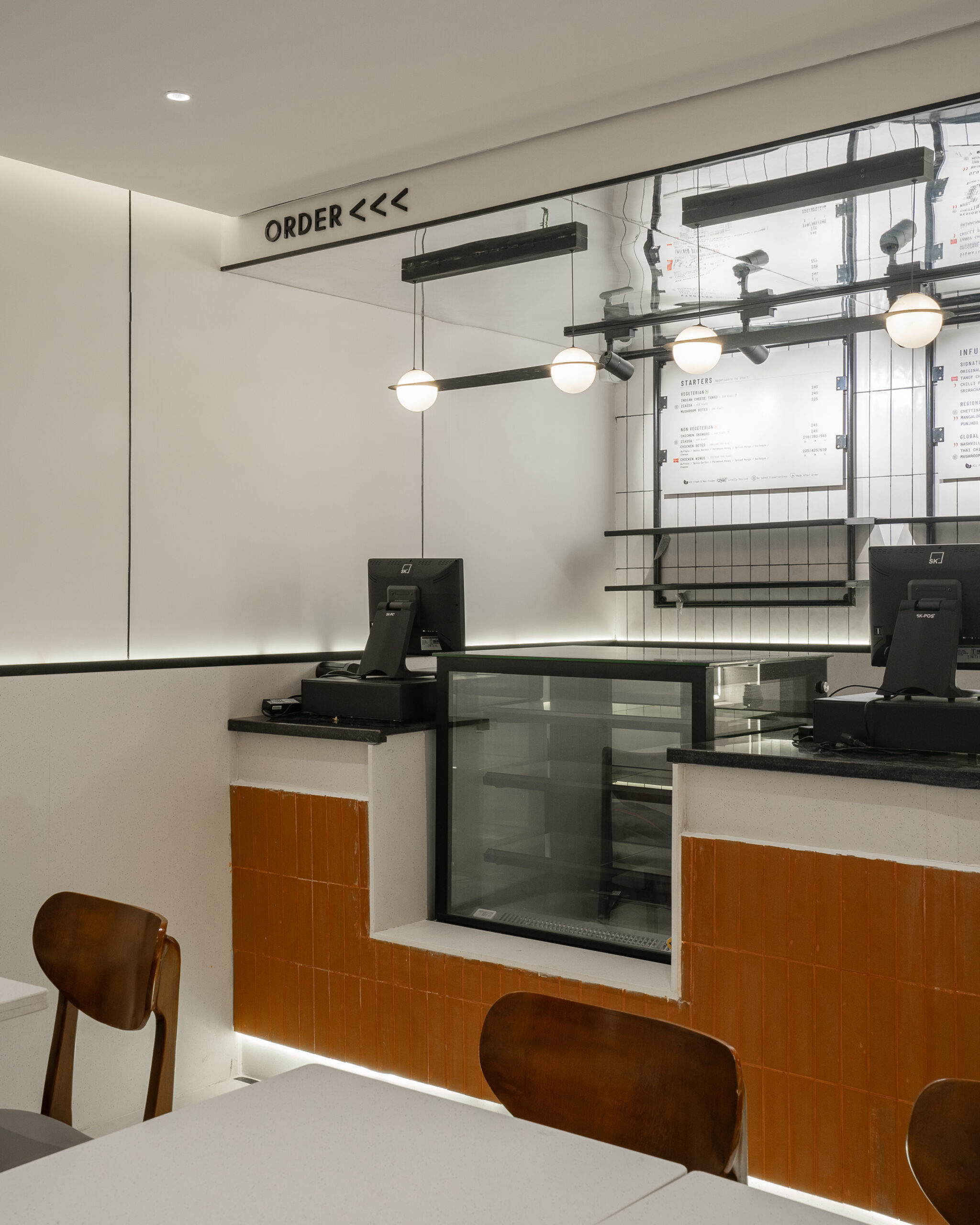
The same brick red is brought indoors with terracotta tiles on the cash counter. The chairs are made with locally sourced wood and are polished. The store looks more modern yet minimal, the backsplash of the counter is made with white subway tiles as in the facade.
To avoid chaos during fulfilling orders, the order and pick-up counters have been carefully divided by stairs leading to the upper floor. This ensures a seamless transition between spaces and food ordering. Lighting along the stairs to create interest towards the forefront of the restaurant. This is the view a visitor would see as soon as they enter the restaurant.
To make the ceiling look higher above the order counter, a reflective silver ceiling has been incorporated. The reflections make the space look spacious and make the restaurant look bigger. The false ceiling is minimal with cove lighting on either side.
GEOMETRY
The use of simple shapes and lines can be observed throughout the design. Circles, rectangles and triangles adorn the walls. The logo of Tovo, which is two triangles facing each other, is featured on the elevation and indoors.
Circular wall sconces are subtle additions to the plain walls with warm lighting. This balances the cool tones of white and concrete in the interiors. Curves have also been brought by dual spherical hanging lights right above the cash counter.
The most important detail of the whole project is black grooves which look like lines drawn throughout the project. It binds all the different elements and materials together for a smooth and sleek finish in the elevation and interiors.
CONCLUSION:
The restaurant is a mix of Scandinavian and Indian local aesthetics. This is seen in the colour palette and the choice of materials. Asian concrete is chosen as the base for the facade and is accentuated by black grooves and white tiles for the name board. The brand identity resonates throughout the restaurant through symbolism.
 |
 |
 |